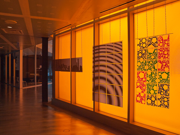
I checked out the school colors of the Illinois Institute of Technology and was surprised to find out they were scarlet and gray. After a visit to the very orange interior of the McCormick Tribune Campus Center, I was certain their colors were orange and orange.
The story going around campus was that architect Rem Koolhaas is Dutch and the Netherland’s royal house is the House of Orange, so the building was designed as a tribute to “the Orange”.
Not so, said Koolhaas when asked. He explained he simply likes the color.
These pop art panels were designed by the New York City design firm, 2×4, Inc.


This is a way cool photo. I’d say the architect is a closet Tennessee fan.:)
I’d prefer purple 😀
I like the color too, bit I wonder how long I’d like it. Sure makes an attractive photo though!
Terry, I’m thinking, if I were cramming for an exam, or if I’d had a long night maybe celebrating, I might not be too fond of so much orange, either.
I could get used to orange when it’s presented so beautifully. Thanks,Bo!